Next, a Re-Positioning
This article is a continuation of the story of our rebrand process. Read the first steps here.
Getting Started
Dusting ourselves off from the aftermath of the pandemic, the Isle of Man team found we had mostly completed a pivot towards building software for third parties, which we’d started during the pandemic and turned out to be rather good at.
To complete the pivot, we had to reshape our business and our brand, and so we had a number of things to decide and then, most likely, change.
We started most of this work on a rare in-person get-together on the Isle of Man. During the pandemic, we shut our office down. One of our team members moved to the Netherlands and another began splitting his time between the Isle of Man and the UK, so we’d grown used to only seeing the top thirds of each other.
Sitting around a coffee table and snacking on Dutch cookies, we began the business of breaking down the brand.
What Stays and What Goes
Our first conversation was around what we hold sacred. Of the name, logo, typography, colours, values, design styles, etc - which of these, if removed, would feel like a cut too deep?
A long conversation later, we reached a consensus: the name and domain would stay, as would the orange colour we have used from the start. We would keep our values intact and try to keep a bit of the whimsy that we value in design.
Logo + Icon
The original Curbsy logo was developed for us by a freelance designer, who was given the spec of “natively attractive to women, can be clearly read at a distance”, thinking of its eventual use on real estate signs with a target female audience.
Later, we decided to use the black version for the Isle of Man development house and reserve the orange for the separate real estate company in Malta, which was using our software and branding.
Given our new target audience was unlikely to be predominantly female and that we were pivoting to become a software development studio, the logo no longer felt appropriate.
Each of us went off and had some fun with fonts, researching trends and playing around with various options, sharing our favourites with the group. An instant favourite was Josefin Sans, which fit our desire to appear more corporate but not too serious. Importantly, it felt like an upgrade but not a complete departure.
The spacing between letters, the kerning, felt off, however. So our designer (who went from freelance to in-house over the course of this rebrand), did some custom tweaks to get it balancing better.
Generally, the spacing is tighter, but some letters are closer together than others. The designer carefully balanced each letter against the neighbouring ones to find a balance that felt right. This sort of balance seems more to do with perception than mathematics.
On to the icon.
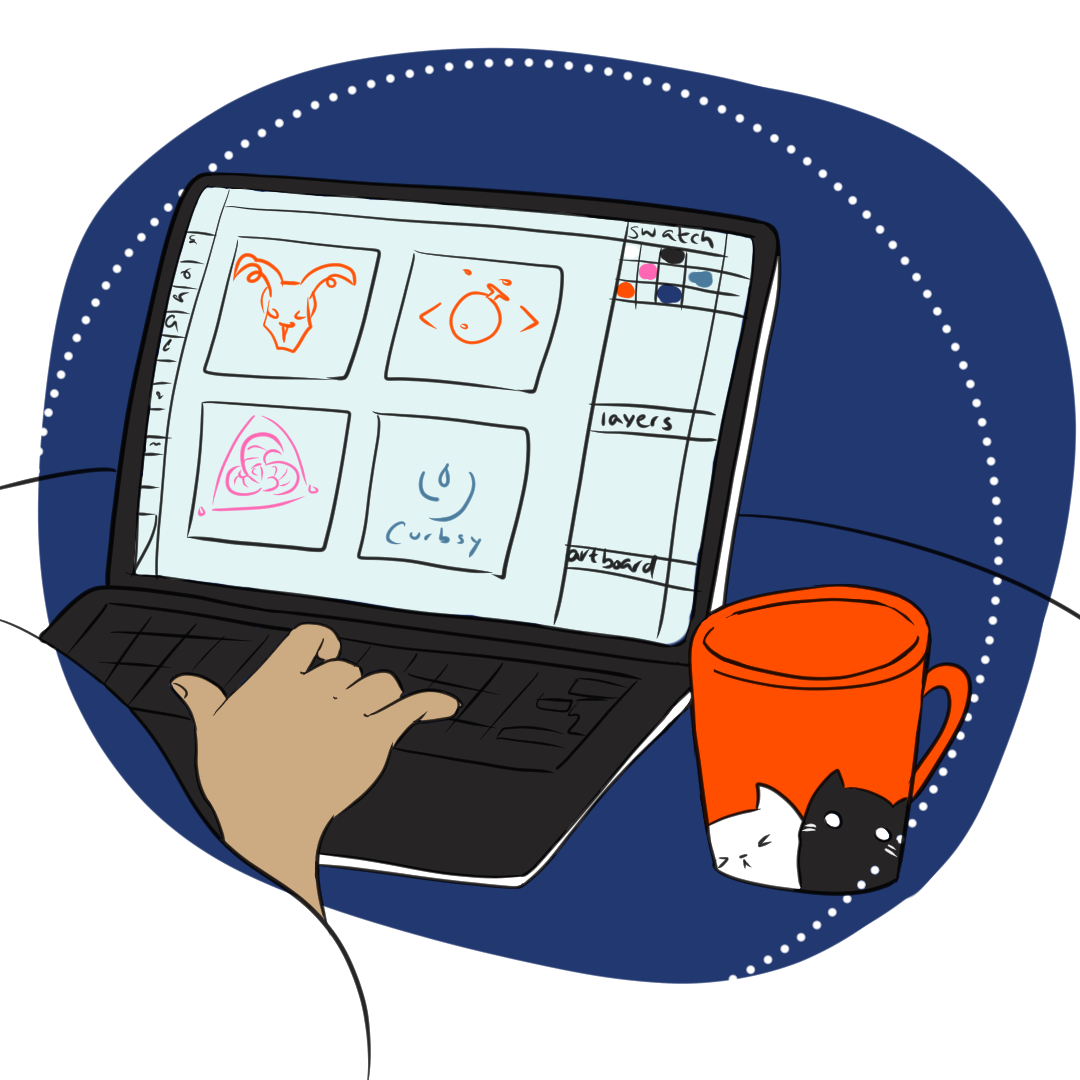
The Curbsy logo historically had no icon. This was an intentional choice, as back when the logo was originally being drawn up, an icon felt like an unnecessary design flourish that didn’t add value. In the years since, it has become rare to find a logo sans icon, so we knuckled down to do the hard work of encapsulating our values, design aesthetic and services in a few curves and lines.
Our first efforts were a complete misfire. We had asked the designer to include some element of Manxness, which became the focus rather than a flavour.
Although we all love Loaghtan sheep, it turns out they don’t make great icons, at least not for a tech company.
Our next set included a new pink that we instantly liked.
The icons themselves we were torn on. We liked bits and pieces of a few of them, but none of them enough to progress the concept. We did try with the potion flask, but after a few back-and-forths, we realised that was another red herring.
We took it away from the drawing board and back to the table. What was it that we liked about these? Did any of them say “top-quality software development”? More research and further conversations led to a request to explore a network icon. The first draft was already much closer to what we aspired to.
Our thoughts on this were that we liked the overall shape, but we worried that it A) too closely resembled a popular CRM’s icon, and B) was too spindly for use as a favicon. (On favicons, I freely admit to being a little obsessed. A brand in miniature? Yes, please. A good favicon, to me, is quality design at its best.)
The next set brought us this evolution.
The colours were nice, but all wrong for us, but there was something here that we liked. It felt technological in nature. It also balanced well. And there’s a hidden C in it, more visible in the slimmed-down favicon than the main icon.
With a bit more tweaking, we have our final design. It felt interesting, confident, technological. It felt whimsical but not flimsy. And although it did not represent our Manxness at all, it felt like us.
However, it did not work as a favicon, so we slimmed it down a little. This one works in a smaller format the primary one, although is unmistakeably related.
Actually, the final final design came soon after, when one of our developers posted excitedly in Slack near midnight. Although it’s unusual for an icon to be animated, we immediately loved it, for the design itself and the small bit of whimsy it added to the site. After all, it’s not every logo icon that can tell time.
Typography
After picking Josefin Sans for our logo font, the road was paved for our header font to be chosen. Our designer did some research into pairings, but we all decided that we just liked Josefin. We like the quirky slants and odd endings, and we also liked how legible it was. Plus, I’m a sucker for a good ampersand, & Josefin has one.
We did adjust the kerning on our site, as the standard spacing for Josefin doesn’t always work well. A new word learned for me: tracking is the process of changing spacing between letters in a uniform manner.
With the header font agreed on, body font was next. Our designer continued her research on good font pairings, and meanwhile our developer used Rubik as a placeholder to keep everything moving forward.
When our designer came back with a recommendation of Cardo, we realised that we’d all kind of fallen in love with Rubik already.
Here they are side by side, with Rubik on the left and Cardo on the right.
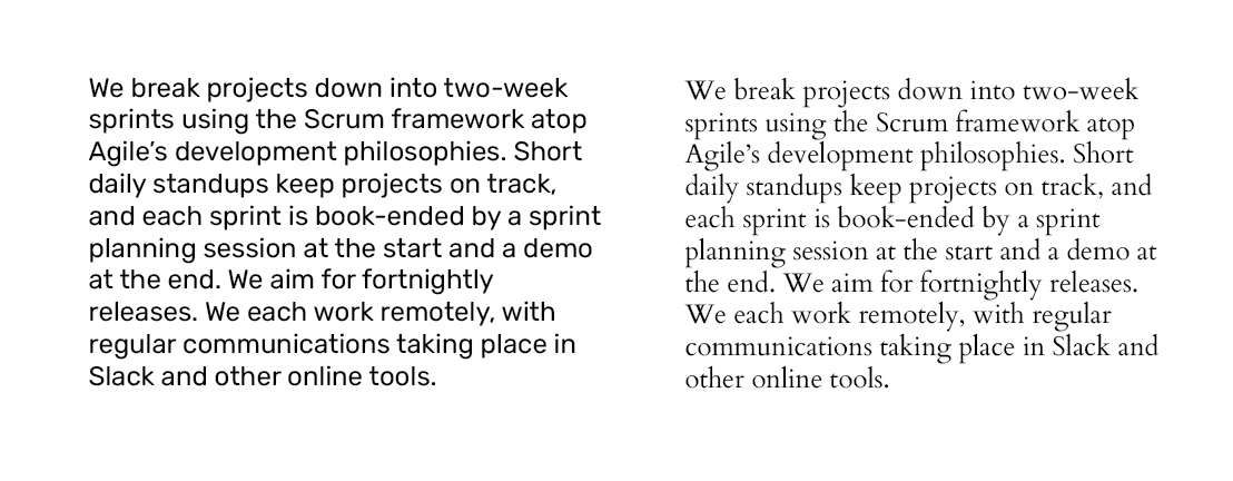
Cardo is just so classy and easy to read. But “classy” isn’t what we were going for in our rebrand. Although it’s a great thing to be, “classy” and “whimsical” make uncomfortable bedfellows. So we stuck with Rubik.
Colours
Our original colours were meant to feel beachy and Mediterranean. This was no longer a good fit for our more-corporate future, so we agreed to keep the orange and drop the others. We weren’t using them much, anyway.
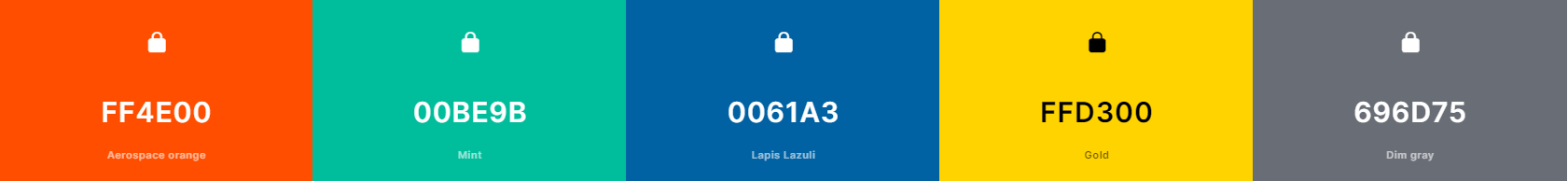
I’d like to say that we decided quickly on a new set, but what followed was probably the lengthiest part of this rebrand. We all get along quite well, but when it comes to colours, the only thing we could agree on what was that we didn’t like each other’s favourites.
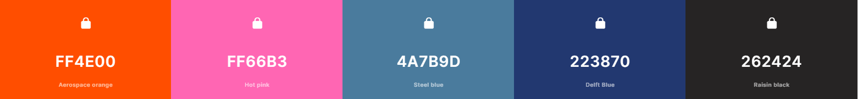
We decided early on that we like a pink with the orange, but which pink? And we all were immediately drawn to the richness of Delft blue. It took probably dozens of iterations to reach the above set, which I think we’re all quite happy with. (But we’re going with it whether we’re happy or not, dammit.)
Illustration Styles
Our old website used stock illustrations, which felt right when deciding on them but quickly began to feel boring and stale.
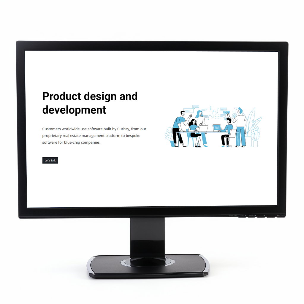
Professional or bland? I think we were aiming for one but squarely hit the other.
To turn things on their head and shake them thoroughly up, we turned to Midjourney to decide our placeholder (and maybe permanent!) images. Midjourney is a generative AI program that turns a natural language prompts into art - it might be the height of cool right now, at least in the geeky circles we run in.
The result? We got a mixed bag, with some images having exciting potential and others being fussy or even bizarre. Because each image was independently generated, there was little aesthetic coherency between them.
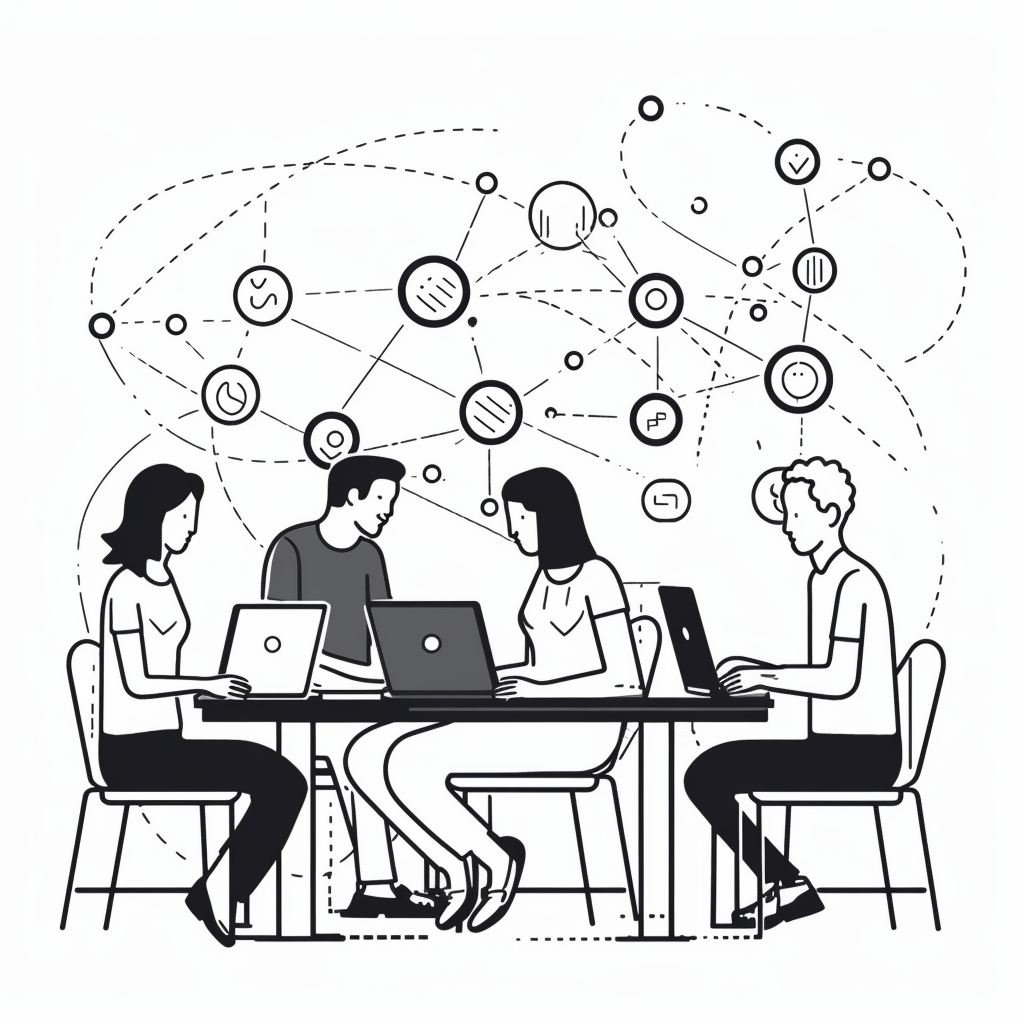
However, it was useful to shake us out of a creative rut, and a couple of the images were subsequently re-drawn by our designer to match our new stylistic direction.
To decide that new direction, we looked at a lot of websites and tried several different styles.
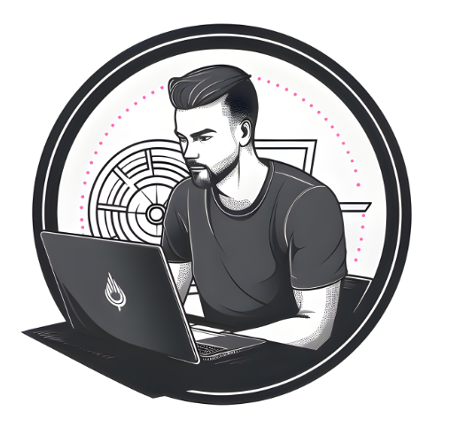

Here is the original Midjourney image that we were playing with as the hero image for the homepage, with only minor modifications. The style wasn’t quite right and the guy looked a little too “bro”-ish for my taste, so we gave the image to our designer to try out different styles with.
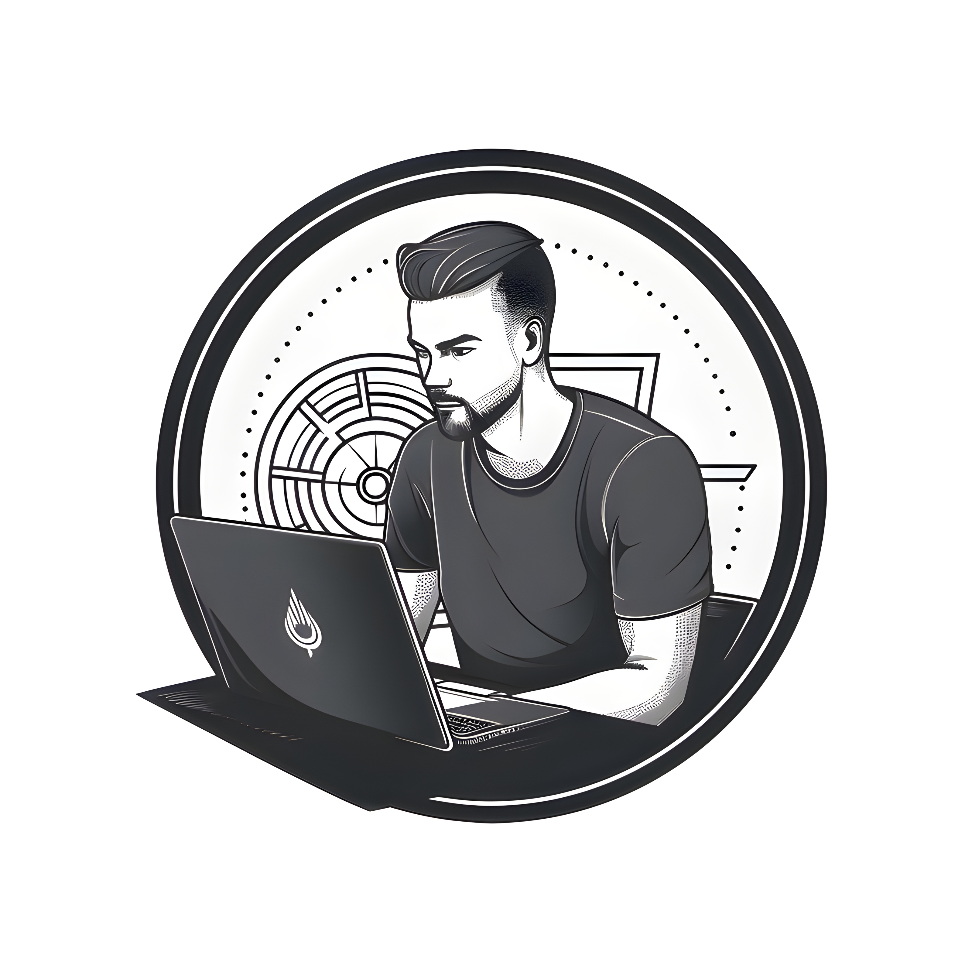
Turning the guy into one-line line-art yielded something weird and a little unsettling. Poor guy went from being a bro to being a creepster. But hey, we tried!
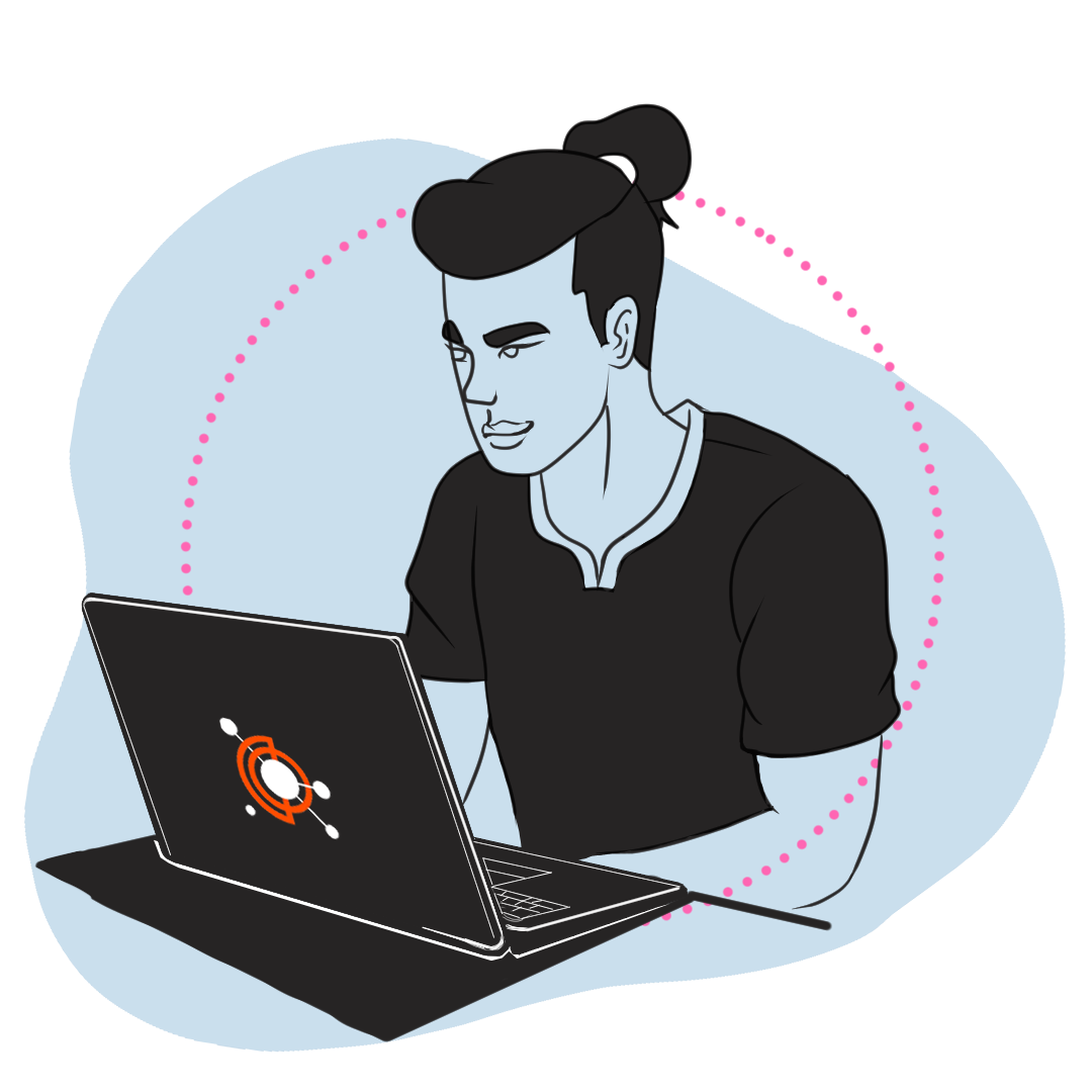
Our next attempt utilised this simple and unique style with minimal colour, something we were excited to try out. We liked this, but didn’t love it. Maybe it was the blue skin. Or the ponytail.
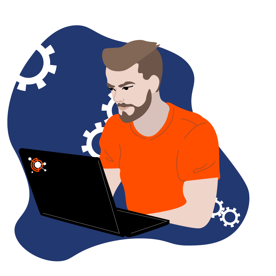
Our next attempt felt closer, but still not on the mark. The cogs were borrowed from our previous website design, but we didn’t like them then and they didn’t improve with age. This style could have been a winner for us with some modifications...
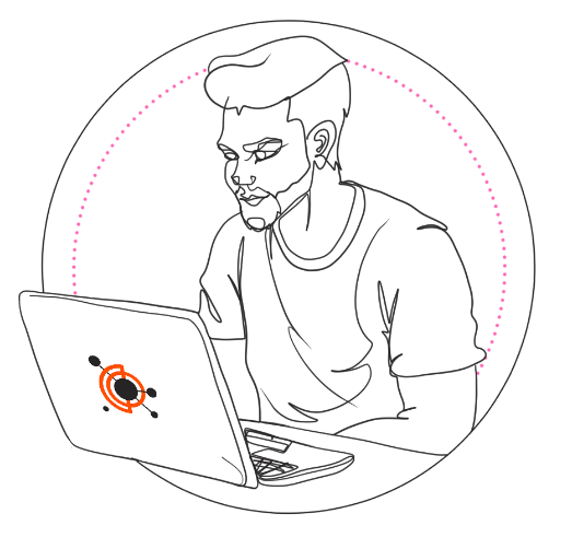
But then our designer dropped an update that we liked much more. We liked how a few lines used in this way can convey an expression, we liked the developer-slump of his back and we liked how clean the design felt, but I think the thing that swung the vote in his direction was that he could conceivably be an extra on Archer.
At this point, I called a halt and said I’d sleep on it. Sometimes you need fresh eyes to be sure of something. In the morning, it still looked great, so we adopted this as our style.
This this decided, our rebrand was mostly complete. We had further discussions about how we describe the company. Are we a software development house that can do anything for anyone? Or are we a boutique agency that works in close partnership with a small number of clients? More the latter, but who knows what the world might throw at us next!